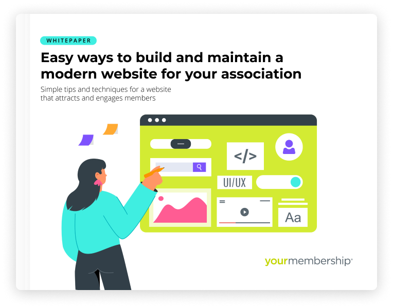
Your association’s website has the potential to attract and engage members, but it requires a modern design. Here are top tips for creating a website design that helps you convert prospects into members and keeps your current members happy.
Your association’s website reflects your organization. It’s your digital first impression. It can also help you highlight and provide access to valuable member benefits. So, it’s important to view it as one of your greatest assets for member acquisition and engagement.
To help you convert prospects into members and keep your current members happy, your association’s website must grab and keep your prospects’ and members’ attention. And to do that, you need a modern, well-designed website.
Benefits of a modern, well-designed website for associations
Consider these benefits of creating and maintaining a modern and well-designed website for your association:
- Boost your association’s brand awareness – Your website is a top vehicle for creating brand awareness among prospective members. A modern website design strengthens your brand in your industry.
- Optimize the member experience – Website design is about more than just visuals. It’s about content and navigation as well. By balancing form and function, it can drive organizational goals and meet your members’ needs.
- Improve member engagement – Your website has the potential to increase engagement with members so they see you as an ongoing, relevant industry leader.
Tips for a modern association website design
So, what does a modern website design include? Here are some top tips for a modern website that will help you attract and retain members.
-
Make navigation clear and simple.
Navigation is a cornerstone of usability. It doesn’t matter how good your site looks if visitors can’t find their way around it. A modern design incorporates best practices for navigation and user experience that makes the site easy to use. For example, your site navigation should:
- Use the simplest possible site structure.
- Make it easy for site visitors to understand what can be clicked, hovered on, or interacted with on the site.
- Use the same names for things in multiple places. (For example: A call to action and a menu item directing a visitor to the same place should have the same name.)
-
Present an attractive visual design.
Your website should incorporate modern best practices to make it easy for your site visitors to scan your content and interact with your site. For example:
- Consistently use brand elements – Consistently use brand elements (such as logo, color palette, and imagery) throughout the website.
- Make it easy to scan – Making your site easy to scan will help prospects and members find what they are looking for or complete a task they came there to do, such as sign up for a membership. This can include using elements such as headlines, bullets, and images to break up text – making it easier for visitors to read content and for you to highlight key messages.
- Incorporate white space – White space gives your design balance and enables the visitor to easily read without feeling overwhelmed. Despite its name, white space doesn’t always mean the color white. It’s the margin or padding around elements to create balance and legibility. It increases comprehension, draws attention to important calls to action, and creates a clean, user-friendly design.
-
Use effective calls to action.
Calls to action direct prospects and members to take the course of action you want them to take and helps them find what they are looking for. Effective calls to action draw people through your site to interact, or literally take an action, such as completing a membership application.
When thinking about calls to action, keep these in mind:
-
- Who is your audience?
- What do they want and need?
- How do they want to engage with you?
Calls to action can be presented in different ways. Buttons, banners, boxes, icons, and so on. Your website should be built with a strategy around what your visitors need to do, creating the ideal experience for them.


